
Recently, I’ve been playing and testing a few apps and games for fun. This week, I’ve tested the mobile game “LOST MAZE”, from the developer ZHIPENG WANG. While playing the game I was looking at elements that were good and easy to use and elements that could be improved. The structure of this post is composed of a small description of the mobile game, followed by good and bad points and a few recommendations. I’ve played this one in the iPad. Hope you enjoy it! :)
Description
The game is a 3D mobile game in which you have different levels of a maze to decide the best way to your home. The narrative is about collecting items that were stolen by “darkness” (represented by black and white interface). You start as a girl and during the game you can buy new characters. The maze is 3D and you can drag the best “way” for your character to pass. This maze is like a “cryptex” and you have to choose the best combination for your character to pass safely. The character walks through the maze automatically. You have the option to “stop” the character and then choose the best way in the maze. You win each time you pass a level. There are many ways for you to lose: you can be eaten by a flower or jump in a wrong way. This changes according to each level.
Good points
The points that I’ve enjoyed in the game were actually the animation and the little story. I think when darkness goes and steals things from the girl’s place it’s quite interesting. When you have to collect the items to put them back to the “map” is quite unusual as well for a mobile game (this one was played in iPad). The music is good too.
Not so good points
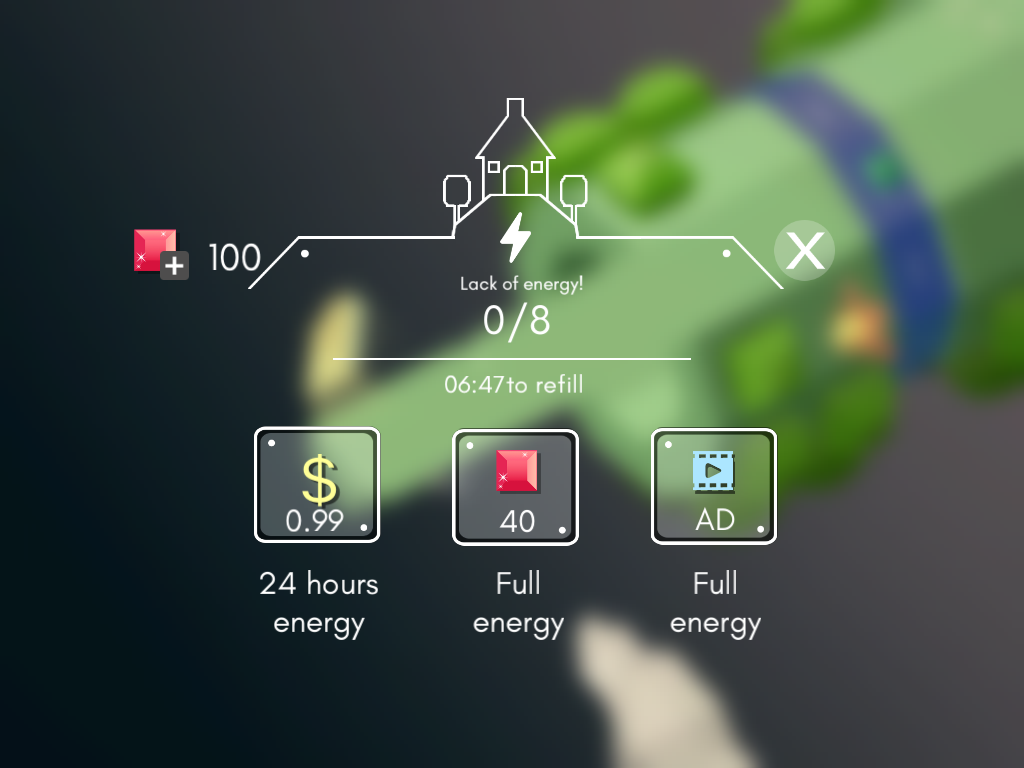
a) In-app purchase surprise
My first comment was: “Why do I need to buy more energy?”. It is not clear what this energy is about. I didn’t realise the moves were related to energy and it took me 4 levels to find this out.
b) Font, typography quality
The button “stop” has a very poor quality, which could give an impression that the game has poor graphics. The same happens in the screen when you click in the red stone to buy more energy. I understand it was a way to create a shade because of the background, but it didn’t look nice.
c) Timing to stop and change the way
Around level 3, when you start having the “jump” I took a long time to stop the character and move the bits to the right position. It could be a bug or something, but it made me feel very frustrated.
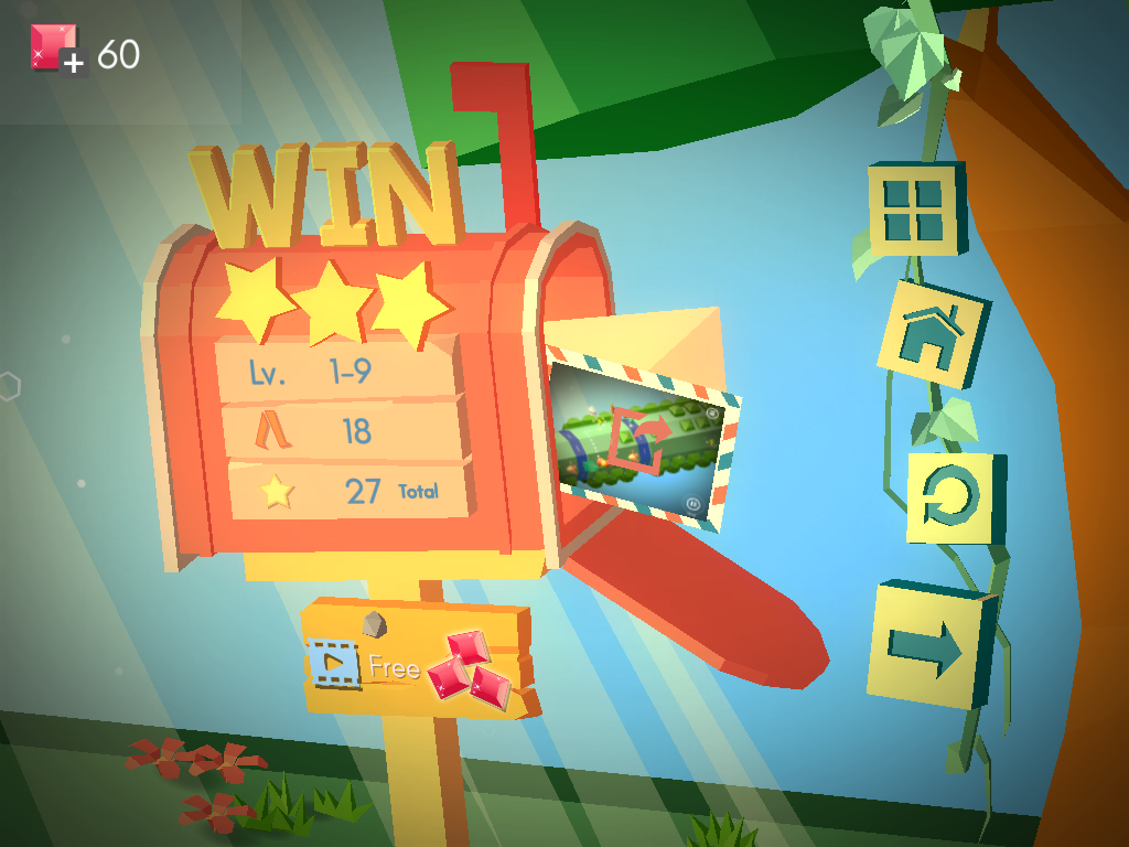
d) Win scene
The win scene does not fit the overall style of the game. The graphics look very different and distorted. The idea is good, but the integration was not well executed. I’ve showed other people and their comments were: “the graphics are not good, right?”. You can also see how many steps you’ve taken in this screen, which doesn’t mean anything in terms of the game.
e) IAP icons and red stone
What are the red stones? I think the screen for the IAP is problematic and the icons do not fit the 3D style of the game.
Recommendations
a) Evidence of energy
As a player, you want to know the consequences of your actions in the game. You could show to the player that when you stop and walk you lose energy. This is not clear in the whole game. Maybe in the first level, when you do the first challenge, it could be evident that you lose energy. Maybe the steps that you’ve taken could show how much energy you lost.
b) Integration of the graphics
The stones and the other icons don’t look 3D. You could redesign those icons for a 3D style. The stones could also have a purpose and integration with the narrative.
c) Stop and walk
This action is not consistent as sometimes you can’t stop and the game forces you to lose. It is important to solve this type of bug very quick!
Conclusion
I would say that it was a good game, but the IAP integration was very frustrating and the bugs made me feel without motivation to continue playing it. In sum, it is possible that those games might need a kind of heuristics of usability related to IAP. For example, as the game as IAP structures, the user should be aware of that. I strongly suggest that UX designers and researchers could come up with ideas to analyse and measure the effectiveness of IAP in games like that.
Game link: https://itunes.apple.com/us/app/lost-maze/id1130186793?mt=8 / Played in 28th August 2016