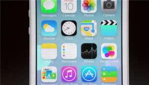
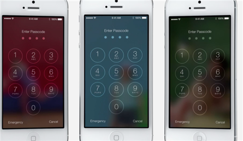
The widely expected day that Apple would launch new features has come. The Apple’s annual WWDC conference brought lots of suprises for the community. The most commented fact was that iOS7 has been completely redesigned, becoming flatter… And….
I must say that it seems that everyone just got interested by the flat interface. I believe in context + funcionality. I think that making things more simple is always the best choice. Why we don’t call flat as just interface? Sometimes it sounds like an artistic movement, like surrealism.
Visual design is in the top of the UX iceberg. That’s the feature that people really ‘see’ but and the rest of the structure? Where is it? I believe that one app/system should work well for what we really need in a specific context. What I mean about it is that, in my opinion, interaction should be meaningful. It should work according to people’s needs. I don’t mind if this is flat. Maybe it’s better for my reading. I need to test it before saying anything. But the keyboard is going to change? And the gestures? Are we ok with this interaction? Is that ok?
The design of iOS 7: simply confusing vrge.co/115jJ3b
— Joshua Topolsky (@joshuatopolsky) June 11, 2013
Am I the only one thinking the new iOS7 looks like a huge step backwards? I like minimalism, but this just looks …badapple.com/ios/ios7/
— Lea Verou (@LeaVerou) June 11, 2013
What happened with iOS7? — WWDC Round-up — Medium ulnx.co/107acdg
— Oliur Rahman (@UltraLinx) June 11, 2013
I will tell a story. My dad is a businessman and he told me: “I got a good app in my tablet (showed me Google Translate) and you don’t need to type anything, just write and it recognizes your handwritting.” Well, this is good because in my app in my Ipad I need to type. And I must say, I don’t like typing in my devices. Why? I don’t feel this is the best experience for me. And I think this can be other people’s problem. But we are always getting used to new technologies.

And what does it have to do with flat? Well, again I don’t mind if it’s flat. I don’t need flat. I need something that works for me in my context. I don’t need 3D icons, fliters, rainbows.
Is that really important?
I’m not saying that I don’t agree with iOS 7. I just don’t think flat is more important than a new interaction or solution for an old problem (keyboard?). 
Wait till fall
However we can’t judge an interface without interacting with it. That’s the main problem of all the discussions. We are only looking at the top of the iceberg and forgetting all the rest. How do we know if this really works? We all know that interfaces work better in their contexts. We can’t say it doesn’t work or not without using it.
Make something better, then criticize
I remember listening to Don Norman’s presentation at Interaction South America last year – we can’t say that this is a bad solution if we don’t have any other solution. However, WE NEED TO DO SOMETHING MEANINGFUL. So I will leave this post with just a suggestion. We have a LOT of work to do.
See more:
http://www.fastcodesign.com/1672780/why-jony-ive-is-flattening-ios-7
http://thenextweb.com/apple/2013/06/10/apple-2013-wwdc-keynote-ios7-revealed/
http://www.apple.com/ios/ios7/design/
http://www.bloomberg.com/news/2013-06-10/apple-revamps-iphone-software-in-push-to-end-product-funk.html
Brazilian references:
http://youpix.com.br/viral-2/top-10-reacoes-ao-lancamento-do-ios-7/
http://www.techtudo.com.br/noticias/noticia/2013/06/apple-apresenta-novidades-para-o-ios-e-mac-os-x-na-wwdc-2013.html
photo credit: Glamour Cat via photopin (license)

